Highcharts tutorial, using UK gender pay gap data!
Contents
- Requirements
- What are we doing?
- Your first Highchart
- A much more useful chart
- Using data from a CSV file
- Making it look pretty (styling!)
Requirements
- A text editor (I recommend Sublime Text as it marks things up really easily using colour, but textEdit or WordPad or another basic text editor will do! DO NOT USE MICROSOFT WORD!)
- A browser (Chrome is great as it has a developer console which might help you figure out what went wrong, but any browser will do!)
- Patience (most coding errors are tiny things like missed { or , and the sort of thing you will kick yourself over. Do not worry)
- Enthusiasm is always appreciated :)
What are we doing?
For this small project, we are going to be visualising gender pay gap data collected by the government using the javascript library Highcharts. You can find the most up-to-date gender pay gap data on the gov.uk website but the data is incomplete and a little messy. For the purposes of this tutorial, I cleaned the data, and uploaded it to my GitHub account so you can access it directly.
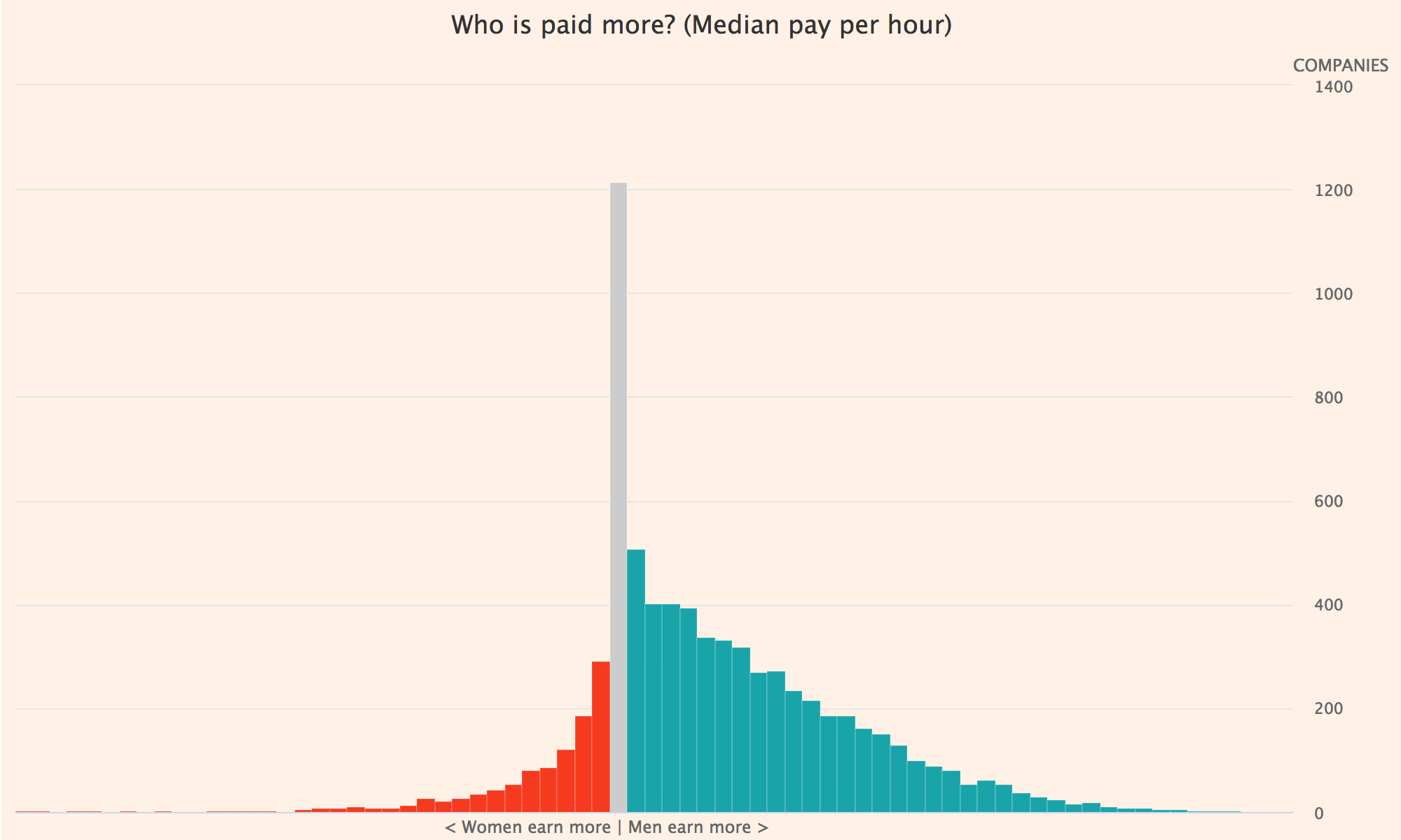
We are going to (try and) replicate this awesome chart from the FT:

Very Important Note: If you want to use Highcharts at your organisation (ie for commercial use), you’ll need to pay for a license.
Your first Highchart
Highcharts is a really easy library to use and doesn’t need much code. All you need to do is set up a <div> container called “container”, and pull in the Highcharts library and jquery. The direct reference to the library is http://code.highcharts.com/highcharts.js so we include that as part of the page in <script> tags.
Create a new text document and open it in your favourite text editor. Here’s the starting bit of code for Highcharts, so copy that in:
<!DOCTYPE html>
<html>
<head>
  <meta charset="utf-8" />
  <title>Chart</title>
  <script type="text/javascript" src="http://code.jquery.com/jquery-1.9.1.js"></script>
</head>
<body>
  <div id="container" style="height: 400px; width: 500px;"></div>
  <script src="http://code.highcharts.com/highcharts.js"></script>
  <script type="text/javascript">
    // highcharts code goes here
  </script>
</body>
</html>
Save it as a HTML page (for instance “highcharttutorial.html”). Then, paste this in between the second <script> tags:
$('#container').highcharts({
  series: [{
    data: [190, 3334, 1792, 1578, 325, 42, 142]
  }]
});
Save it again and open it in a browser. It should look like this:
This is fine but it’s a line chart (which won’t work for our data), it has no title, no categories, there’s a Highcharts logo on it, and the axes aren’t labelled. It’s a bit useless for what we want to make.
While you’re working on something like this, it’s really useful to keep saving the text document and then refreshing the browser so you can see exactly what you’re doing in real-time. There’s a lot of back and forth!
A much more useful chart
We need to add a few more different settings so we can make it look a bit better. We want to get rid of the highcharts logo at the bottom, add a good title, add in the categories and an X axis title, and get rid of the legend for now. Here’s how we do those things:
  $('#container').highcharts({
  chart: {
    type: 'column'
  },
  credits: {
    enabled: false // removes Highcharts.com logo at the bottom
  },
  title: {
  text: 'Organisations reporting their GPG, by number of employees'
  },
  xAxis: {
    categories: ['< 250', '250-499', '500-999', '1,000-4,999', '5,000-19,999', '20,000+', 'Not provided'],
    title: {
    text:'Number of employees in organisation'
    }
  },
  yAxis: {
    title: null // disables title on y axis
  },
  legend: {
    enabled: false // disables legend
  },
  series: [{
    data: [190, 3334, 1792, 1578, 325, 42, 142]
  }]
});
New to HTML? The forward slashes you see
//in the code snippet are a comment, which tells the browser to ignore whatever comes after it. It’s really useful for leaving notes for yourself so you can remember what does what.
It’s hard to remember exactly what the configuration options are, so Highchart developers created the Highcharts API reference documentation which explains more about the different things you can do with a chart built in Highcharts.
Now we’ve changed the title of the X axis, gotten rid of the annoying Highcharts logo and the legend, here’s what that should look like:
Using data from a CSV file
Highcharts is able to take data from a CSV file as well, and this is what we want to do to make our fake FT gender pay gap chart. Whereas before we always entered in the data manually, this time we need to tell it where to get the data from.
Firstly, we need to make sure that we have the Highcharts Data module, because without this vital piece of code, nothing will work! This is how we include the data module:
<script src="https://code.highcharts.com/modules/data.js"></script>
Make sure you add that after the code which points to Highcharts, and before the rest of the script, otherwise it won’t work.
Next, take out the ‘series’ section in the chart generation section, and replace it with this:
data: {
    enablePolling: false,
    csvURL: 'https://raw.githubusercontent.com/sophiewarnes/sophiewarnes.github.io/master/Training/Files/paygapdata.csv'
  },
In this, enablePolling is set to false - if it is set to true, it will keep refreshing the chart (useful for live data) but we want the chart to be static because we aren’t reading data from an API.
We can set the container to be a bit bigger as well, which will help:
<div id="container" style="height: 600px; width: 1000px;"></div>
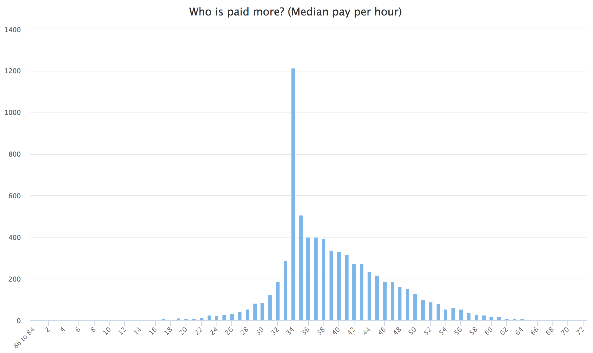
That should all now look something like this:

Making it look pretty
Now we get onto the fun of styling!
We want it to have the distinctive FT background, to do this we need to add in backgroundColor: #fff1e5 in the chart element. We are also going to add a margin at the bottom for the text, so:
chart: {
    type: 'column',
    backgroundColor: "#fff1e5",
    marginBottom: 20
  },
Then, add a plotOptions section. This means that we want to colour certain elements different colours. What we are doing here is picking out the columns on axis x - those which show women being paid less than men, and women being paid more than men. We also want to remove the padding in between the columns because they are a bit much - what we’re trying to create is a histogram showing distribution of gender pay gaps, not just a column chart.
plotOptions: {
        column: {
            colorByPoint: true
        },
        series: {
        	pointPadding: 0,
        	groupPadding: 0,
        	borderWidth: 0.2,
        	zoneAxis: "x",
            zones: [{
                color: '#f93807',
                value: 34
            }, {
                color: '#CCCCCC',
                value: 35
            }, {
                color: '#00a4aa',
                value: 74
            }],
        }
    },
Then we want to make sure that the title for the y axis is on the right-hand side. Opposite being set to true moves it to the right hand side, the text is what we want it to show, the rotation is 0 to make sure that it remains readable left to right (if this is not changed, it will be facing the wrong way - try the code without the rotation line and you’ll see what I mean.) y is being set to -10 to make sure it floats above the top of the line on the right, and not on it.
  yAxis: {
    opposite: true,
    title: {
    	align: 'high',
        offset: 0,
        text: 'COMPANIES',
        rotation: 0,
        y: -10
    }
  },
Next, the wording at the bottom! This is a bit of a fudge, which is the technical term for ‘there are more elegant ways to do this, but this works just fine’. We want to add something explaining what we’re seeing - the left-hand side shows companies where women earn more than men, and the right-hand side shows women earning less than men. The style sets the colour, and x and y set the positions on the chart. X is minus, because 0 is based at the centre of the chart, as set by align. If Y was 0 it would be at the very top of the chart, which is why we are moving it all the way down until it’s nearly at the bottom (remember, our chart is only 600px high).
  subtitle: {
    text: "< Women earn more  |  Women earn less >",
    align: "center",
    style: { "color": "#666666" },
    x: -68,
    y: 585
  },
This is a really small thing but I don’t like the ticks that come off the chart on the x-axis, so add tickLength: 0 (and a comma, if it comes before something else) to the xAxis element. That gets rid of them completely.
Lastly, I don’t want any of the numbers to come up on the X axis because it’s unnecessary, so we’ll take that out, too:
  xAxis: {
  	title: null,
  	labels: {
  		enabled:false
  	}
  },
If you’re still stuck, get the full final code here
If your code is not working and the chart is not coming up, make sure that you have the correct amount of { and } symbols, and that the commas are in the right place.
WELL DONE YOU!!! You did it!

This is what you should have in the end:

There are better ways to do the text at the bottom, but it’s not bad for a fudge, is it? :)
What next?
If you have finished this, look for other CSV files hosted online (Google “Filetype:CSV” and then whatever search term you want) and try and make a chart with that!