Data visualisation exercises
Go to datawrapper.de - you don’t have to sign up for an account, but it’s useful if you want to keep using it (for free) to create charts easily. Then, pick a dataset from below and experiment with different ways you can visualise it. The datasets are all ‘clean’ but you may want to delete columns to make it easier.
Contents
Datasets
Some datasets to try out:
-
Prescription data (top 10 prescriptions in England, from 2006 to 2016) Download CSV -
Help to Buy data (Wales, by quarter) Download CSV -
Gender pay gap data (number of companies by median gap) Download CSV -
Industry in Wales, by area Download CSV -
Risk of flooding data (Wales, by region and local authority) Download CSV
Note: You can also use the datasets that Datawrapper has to see what works and doesn’t work.
How to use datawrapper
- Download a dataset above
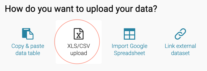
- Import the file into DataWrapper from your computer as shown and click ‘proceed’:

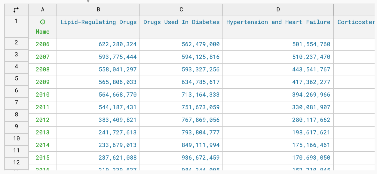
- Check that the data looks how you’re expecting and there’s no red in the table (as shown), then click ‘proceed’:

- Choose the chart type that you think will work well for this data
- Check the ‘refine’ button because that gives you a lot more options for changing how the chart looks, and the chart will update as you play around. You can change colours etc here.
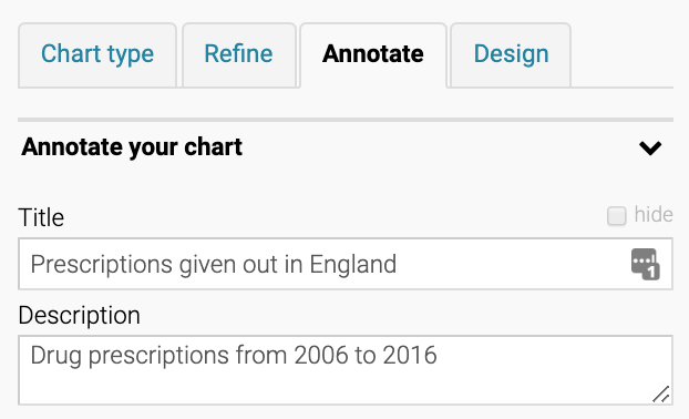
- Look at ‘annotate’ - this lets you add text like a title, subtitle, etc, like so:

- Note you can also check that it’s okay for colour-blind people to tell the difference between line colours…

- Click publish and embed, and you’re done. You can also just take a screenshot of it, which is what I do!
Hints:
- If the chart isn’t working, have you tried transposing the data?
- What relationship are you trying to show? What’s the best way of showing it?
- Have a look at the FT’s Visual Vocabulary to get some inspiration! Not every chart here is available on Datawrapper though.